Early UX Challenge · 2025

Subscription Manager App

Year

Early 2025

Project Type

UX/UI Challenge

My Role

Research, UX/UI Design & Prototyping

Outcome

High-Fidelity Figma Prototype

01. The Project

I created the Subscription Manager as an early UX challenge in 2025. The idea was to explore how recurring payments and subscriptions could be brought into one dashboard so that users could see what they were paying for, when payments were due and where they could go if they wanted to stop a subscription.

At the time, I treated the cancellation journey more simply than I would now. Looking back, there is an important difference between stopping a recurring payment and ending the underlying subscription contract, so I would not now present the concept as being able to cancel every service directly from one app.

Original Goals

  • •
    Bring recurring costs together: Give users one place to review subscriptions instead of finding them across different services and statements.
  • •
    Make upcoming payments more visible: Show renewal or payment information before money leaves the account.
  • •
    Provide a clearer exit route: Help users understand where to go when they no longer want a subscription.
  • •
    Keep financial information readable: Use a simple dashboard rather than making the interface feel like a full banking application.
02. Research Context

Because this was an early challenge, the original case study used broad market claims that did not add much to the design. I have since revisited the idea and replaced those figures with reliable UK sources that give better context to the actual problem.

This research strengthens the portfolio write-up, but I do not treat it as proof that the original prototype was validated with users.

Accidental Subscriptions

Citizens Advice reported in March 2024 that 26% of UK adults had accidentally taken out a subscription during the previous 12 months. It estimated that unused subscriptions had cost consumers £688 million over that period.

Citizens Advice research

Renewals & Cancellation

A UK Government consultation published in November 2024 estimated that almost 10 million of 155 million active subscriptions were unwanted, with around £1.6 billion a year spent on unwanted subscriptions.

At the time, the government was consulting on clearer information, reminders and easier cancellation. I treat this as policy direction from the period, not as rules that were already fully in force when I made the project.

UK Government source

Account Data & Consent

FCA guidance explains that account information services can provide consolidated information from one or more payment accounts. Providers operating these services are regulated, and access to account data requires the user's explicit consent.

That is important for this concept because a real version could not simply connect to someone's financial accounts without the correct permissions and regulated service model.

FCA guidance

Payment vs Contract Cancellation

MoneyHelper distinguishes between Direct Debits, standing orders and recurring card payments. It also notes that stopping a payment does not necessarily cancel the contract with the company.

This is the biggest area where I would now change the original concept: the app should guide the user towards the correct cancellation route rather than promise that every subscription can be ended with one button.

MoneyHelper guidance

What This Means for the Concept

  • •
    Visibility still matters: There is genuine evidence that people can lose track of subscriptions and auto-renewals, so a clear overview is a reasonable problem to explore.
  • •
    Reminders are more realistic than assumptions: Upcoming renewal and payment information can help users make a decision without claiming the app can control every subscription provider.
  • •
    Cancellation needs different routes: The interface should explain whether the user needs to contact the provider, their bank or another service.
  • •
    Trust would be central to a real product: Financial account access would require explicit consent, clear data-use information and an appropriate regulated provider or integration.
03. User Scenarios

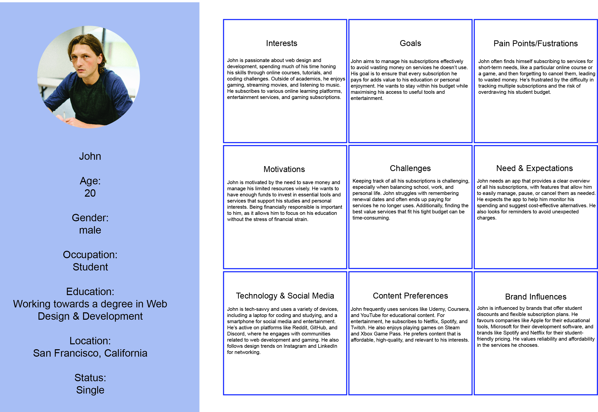
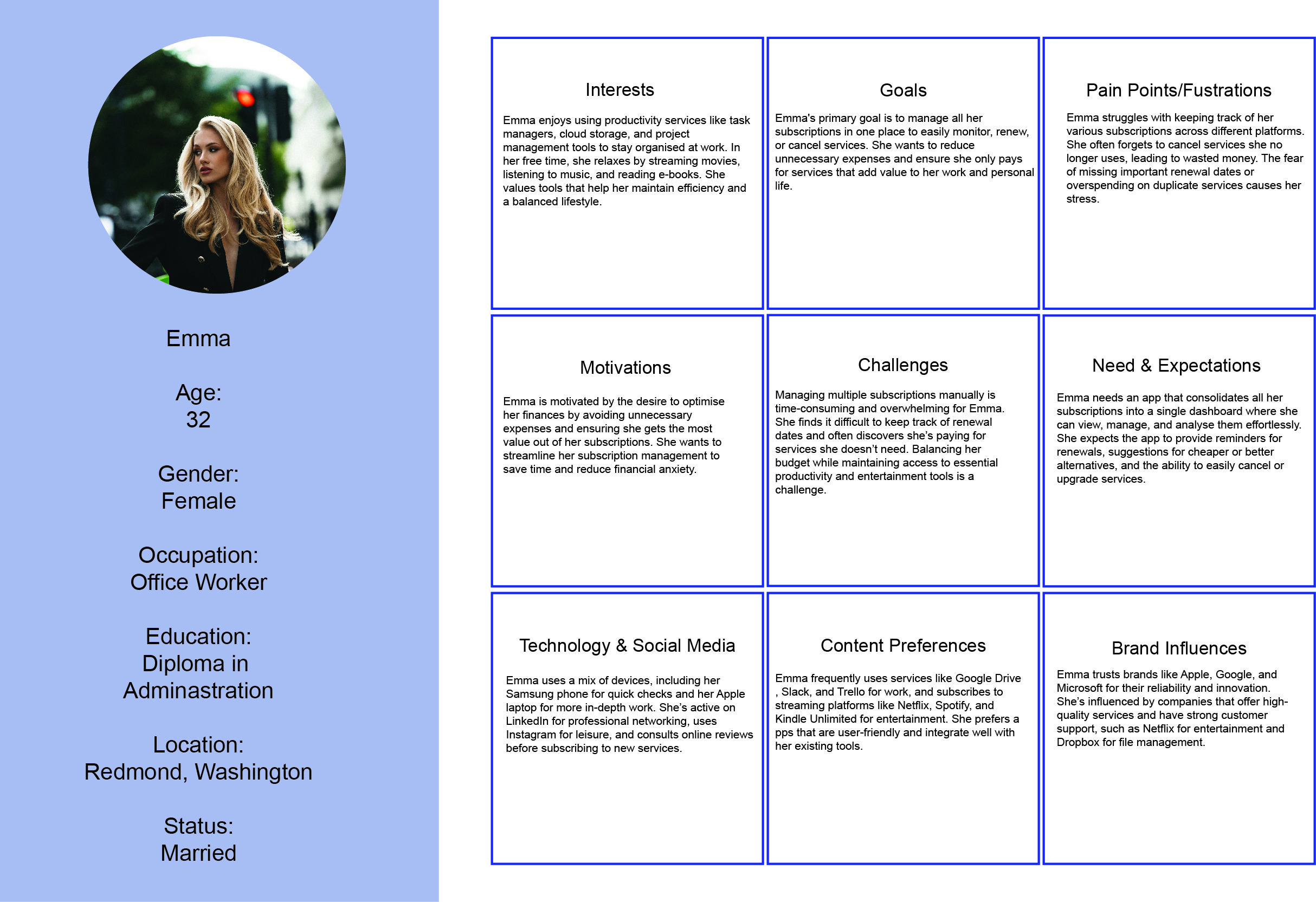
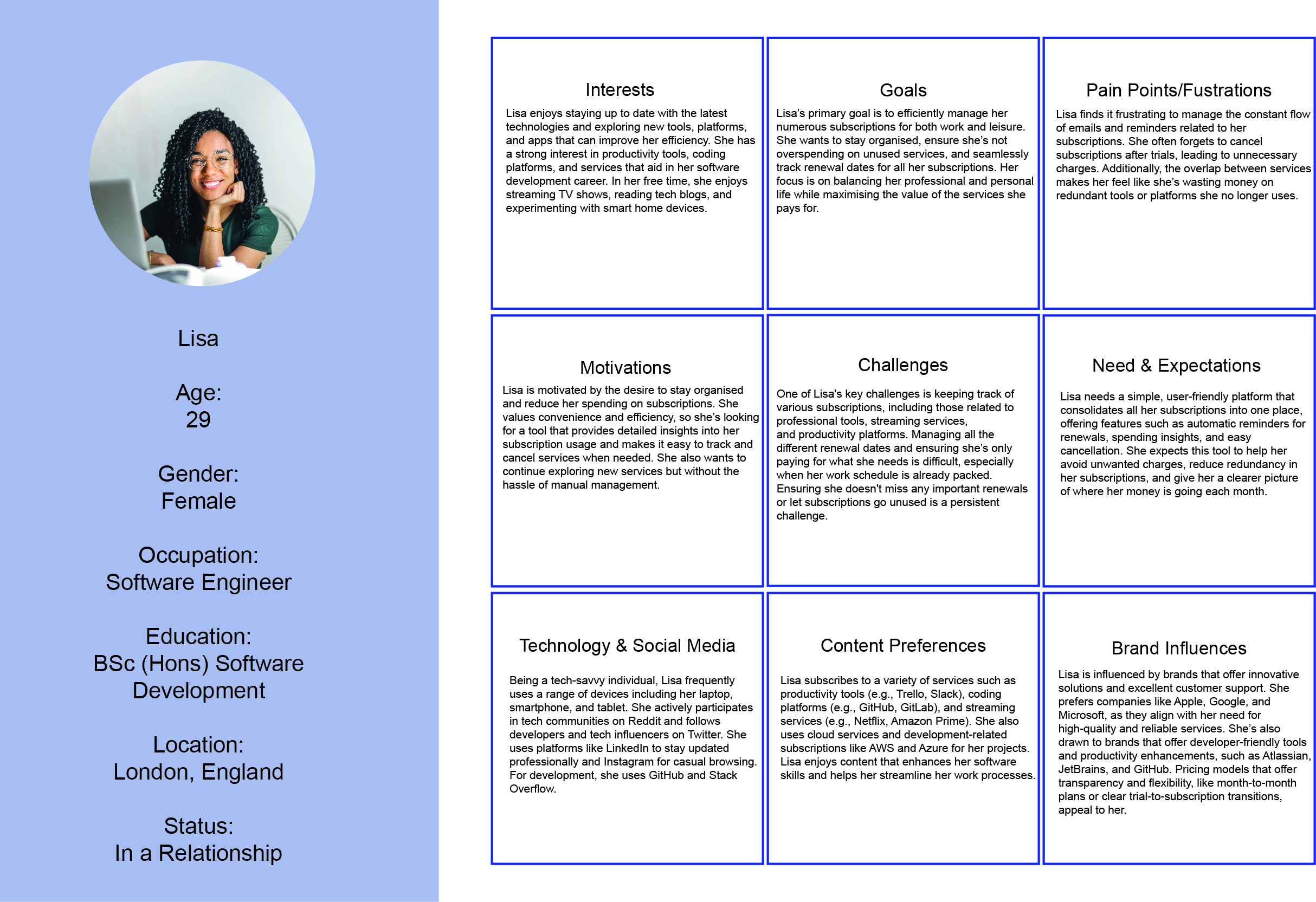
The original challenge used three personas to help me think through different subscription-management situations. Looking back, I would treat these as provisional design scenarios rather than evidence that I had identified three validated audience segments.

Subscription Manager professional persona

The Professional

A scenario focused on keeping recurring expenses visible while having clear information about financial data access.

Subscription Manager student persona

The Student

A scenario centred on keeping costs visible and avoiding unexpected payments after trials or renewals.

Subscription Manager household persona

The Household

A scenario for someone trying to keep track of several recurring digital services and family subscriptions.

04. UX Process

I used the challenge to practise moving from a problem idea into a user journey, wireframes and a higher-fidelity prototype. The dashboard became the main part of the concept because it gave the user a single place to see recurring costs before deciding what action to take.

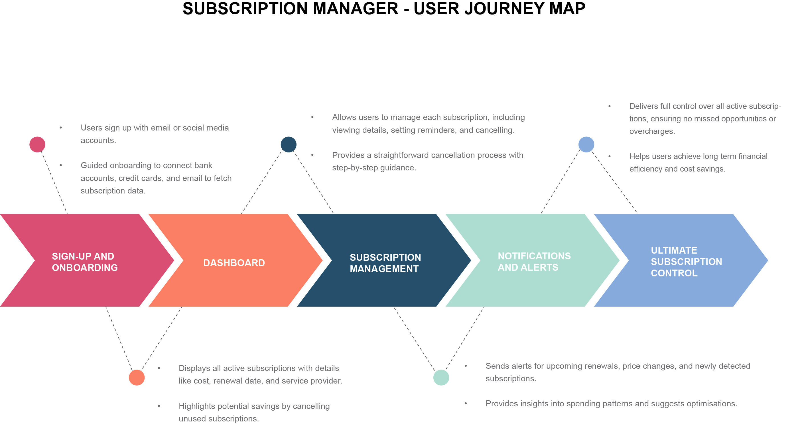
Subscription Manager user journey map

User Journey

Mapping the proposed route from noticing a recurring payment to reviewing the subscription and finding the relevant cancellation option.

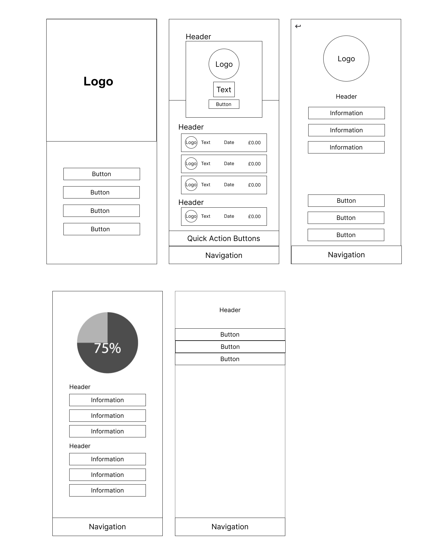
Subscription Manager wireframes

Wireframes

Exploring how recurring costs, renewal information and actions could be organised without overcrowding the dashboard.

05. Design Solution

The final prototype uses a dashboard-led approach. The aim was to make the user's recurring costs easy to scan and then let them move into the details of a subscription when they needed more information.

Core Prototype Ideas

  • •
    Subscription overview: Bring recurring services together in one interface.
  • •
    Payment visibility: Show costs and upcoming payments so the user can see what is due.
  • •
    Subscription details: Give each service a clearer space for payment and renewal information.
  • •
    Cancellation journey: Explore how the user could move from identifying an unwanted subscription towards the appropriate route for ending it.
06. What I Would Change Now

I Would Approach the Design Differently

Looking back at the project now, I would change quite a lot about both the design and the way I approached it. At the time I made the process harder for myself than it needed to be, partly because I was still getting used to Figma.

Adobe XD was the design software I was most comfortable using at university and I continued using it after graduating. I had used Figma in smaller ways before this project, but the Subscription Manager and AcclimatizeMeNow challenges were some of the first times I tried using it for a more complete UX process.

I use Figma much more regularly now and I am far more comfortable with the way it works. If I started this project again, I would organise the file differently, simplify parts of the interface and spend more time thinking through the structure before moving into higher-fidelity screens.

Treat Cancellation More Realistically

I would also change how the cancellation part of the concept works. The original design treated cancelling a subscription as though the app could handle the whole process directly.

I now understand that different subscriptions and payment methods can require different cancellation routes. A better version would help the user understand whether they need to contact the provider, manage the payment through their bank or follow another cancellation process.

Do More Research Before Designing

I would also spend more time validating the problem before moving into the interface. The personas used in the original project were design scenarios rather than people I had interviewed, so I would now want to speak to real users and understand how they currently keep track of subscriptions.

That research would help me decide what information should appear on the dashboard, what people would actually find useful and where the cancellation process becomes confusing.

07. Prototype Outcome

The final outcome was a high-fidelity Figma prototype exploring a subscription dashboard and cancellation journey. It demonstrates the direction of the interface, but it is not a working financial application and I did not run formal usability testing to prove that the flow solved the problem.

Final Deliverable

High-Fidelity Figma Prototype

Main UX Focus

Recurring Payment Visibility

08. Looking Back

This was one of my earlier UX challenges from 2025, and looking back at it now there are parts I would approach differently. The original idea was useful for practising dashboard hierarchy, user journeys and higher-fidelity prototyping, but I was making assumptions about how subscription cancellation and financial account access would work.

I would now spend more time validating the problem before moving into the interface. I would research real user behaviour, test the dashboard with participants and make the different payment and cancellation routes part of the design instead of presenting them as one universal flow.

I still keep the project in my portfolio because it shows an earlier stage of my UX work and gives me something concrete to compare against the way I approach research, prototyping and limitations in newer projects.