Personal UX/UI & Front-End Development Project

Digital Printing Service

Year

2026

Project Type

Personal Project

My Role

UX/UI Design & Front-End Development

Outcome

Working Front-End Demo

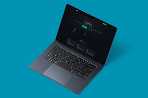
Digital Printing Service website interface
01. The Project

I created this project as a front-end demo for a fictional printing service. I wanted to explore how a printing website could present a fairly large amount of product information without making the ordering process feel unnecessarily complicated.

Printing products can involve several decisions, such as the product type, size, paper or stock, quantity, finish and the artwork that needs to be supplied. My main aim was to organise that information in a way that was easier to follow while still keeping the website visually simple.

Main Goals

  • •
    Make product choices easier to understand: Present the main options without showing everything at once.
  • •
    Keep the route towards ordering clear: Make it obvious what someone would need to do after choosing a product.
  • •
    Handle artwork clearly: Treat file upload as an important part of the journey rather than an unexplained input at the end.
  • •
    Build responsively: Make sure the layout and information remain usable across desktop and smaller screens.
02. Secondary Research

Before building the demo, I looked at secondary research around online retail usability, product variations and file uploads. I also looked at how established UK printing websites structure their ordering journeys so that the project was based on patterns people are already likely to come across.

Online Purchasing

Office for National Statistics data shows that 27.5% of UK retail sales were made online in 2025. This supported treating the website as more than a simple brochure and thinking about how somebody could move towards ordering online.

ONS source

Print Ordering Patterns

I looked at existing print services including instantprint. Their ordering journey asks customers to choose the product, size, stock, quantity and finish before deciding how to supply the artwork. This gave me a realistic structure to compare my own ordering flow against.

instantprint example

Product Options

Baymard's ecommerce usability research shows that product variations and poorly organised product lists can make it harder for users to find what they need. That was relevant to printing because one product can have several sizes, materials, quantities and finishes.

Baymard research

Artwork Uploads

GOV.UK's file-upload guidance recommends making upload requirements and errors specific, including when a file is the wrong type or too large. This influenced how I thought about making artwork requirements clearer instead of treating file upload as a single unexplained field.

GOV.UK guidance

How This Influenced the Demo

  • •
    Break choices into stages: I avoided presenting every possible option at the same time and instead treated product selection as a sequence of decisions.
  • •
    Keep variations connected to the product: Size, material and finish make more sense as options for a selected product than as separate products scattered around the website.
  • •
    Make artwork part of the journey: Uploading artwork is necessary for a real print order, so the interface needs to explain what is expected and give useful feedback if something is wrong.
  • •
    Design for smaller screens: The ordering information needed to remain understandable without relying on a wide desktop layout.
03. Design & Development

I designed the interface in Figma and then built the demo using HTML, CSS and vanilla JavaScript. The development work focused on turning the visual design into a responsive website while keeping the product information and calls to action easy to follow.

I deliberately kept the technology fairly simple. The aim of the project was to practise the front-end experience and ordering structure rather than build a complete ecommerce platform with payments, production management and a real customer database.

What I Focused On

  • •
    Information hierarchy: Separate the main service categories from the more detailed decisions someone would make once they had chosen a print product.
  • •
    Responsive layout: Keep the service information and calls to action readable when the screen becomes smaller.
  • •
    Interaction feedback: Use JavaScript for front-end interactions so the demo feels more like a working website than a static mock-up.
  • •
    Simple front-end structure: Use semantic HTML and CSS rather than adding a framework that the scale of the demo did not require.
04. Challenges & Changes

Making the Content Responsive

One of the main problems I ran into was making the amount of content work properly across different screen sizes. The printing service has several product categories, options and pieces of information that need to be shown, and layouts that worked well on desktop became much harder to manage once the screen became smaller.

I had to change spacing, stacking and how some of the content was presented rather than simply shrinking the desktop layout. This was probably the part of the development process that took the most adjusting because I still wanted the information to be clear without making the mobile version feel overcrowded.

Changing the Colour Direction

The colour palette also changed several times while I was working on the project. I experimented with both lighter and darker directions and there were points where I was not sure which suited the printing service best.

Some of the palette ideas looked good on their own but did not work as well once they were applied across the full website. I eventually moved away from those versions and settled on the colour palette used in the current demo.

Going through those different versions helped me realise that choosing a colour palette is not just about whether individual colours look good. I also had to consider how they worked with the amount of content, the product imagery, readability and the overall feel of the website.

05. Current Limitations

The project is still a demonstration rather than a complete ecommerce system. Because the printing business is fictional, the product information, prices and service structure are there to demonstrate the interface rather than represent a real print company.

The website is also a front-end project hosted through GitHub Pages, so it is not connected to a real payment system, print-production workflow or server-side artwork processing. Those areas would need much more work before the idea could be used as a real ordering platform.

I also have not tested the ordering flow with real print customers or staff working in the printing industry. The secondary research helped me create a more realistic direction, but it does not replace usability testing with people who actually place or manage print orders.

06. The Result

The finished project is a working front-end website demo that shows how I would approach the structure of a small online printing service. It takes the idea beyond a static Figma design and lets me demonstrate the interface and front-end code in the browser.

Final Deliverable

Working Front-End Demo

Built With

HTML, CSS & JavaScript

07. Looking Back

Looking back, the project made me think more carefully about how much information an interface can handle before it starts becoming difficult to manage, especially on smaller screens. The responsive version needed more changes than I originally expected, and I had to adapt the layout rather than simply scale down the desktop design.

I also changed direction several times with the colour palette before settling on the current version. Trying both light and dark approaches helped me see that a palette can look good in isolation but still not work once it is applied across a full website with different types of content.

The main limitation is that I was still designing around a fictional printing business and secondary research rather than real business requirements. If I continued the project, I would want to work with an actual printing company, understand its ordering and artwork process, test the journey with real users and then connect the front end to a proper backend, file-validation and payment workflow.